After having tried countless knowledge management tools that were either too bloated and slow or focused on single users, we set out to create a lightweight wiki optimized for teams.
Some of the main features include:
* Everything is shared in real-time
* Instant fuzzy search
* Markdown commands
* Easy linking of pages using "@"
* Automatic tagging based on page titles
* Graph visualizations of tags and pages
You can think of it as an nvALT + real-time collaboration + rich content.
We've been dogfooding and testing this with a few startup teams over the past few months and would be happy to get your feedback and to answer any questions!
I'm not joking: much of the light gray text on your site and your screenshot becomes literally unreadable when my LCD monitor is viewed at certain angles, not far off perpendicular; it becomes the same color as the background. My monitor may not be expensive, but it's not a cheapo, no-name one either.
I absolutely detest this current fad of thin, light gray text on white backgrounds. Instead of using high-contrast, easy-to-read text, people are using gray-on-white, white-on-gray, even gray-on-gray, and always with thin, narrow-stroke fonts and enormous amounts of whitespace.
And if it's hard to read indoors with no glare on a full-size screen, imagine trying to read it on a mobile device, outdoors, with sun/sky glare, or indoors on a reflective, glossy screen with fluorescent lights' glare.
I mean, look at the bottom of your page. One of the most important links on the page, the "Contact" link, is very light gray, thin text on white. When the cursor hovers over the bottom of the page, the links become slightly darker gray. And when the cursor hovers over a link, it becomes an even darker--wait for it--gray. You've effectively made the "Contact Us" link invisible.
And the screenshot of your product exhibits the same problems: the UI fades into the background to such a degree that it is difficult to see. This is bad enough when talking about a web page whose primary purpose is to look stylish, but your product's primary purpose is to be a usable tool. Are you trying to make the wiki equivalent of Das Keyboard?
Where do these fads come from?
For a good illustration of the problem, I just discovered this web site (which also lists HN as an example of the problem): http://contrastrebellion.com/
Thanks for the feedback. We didn't test the landing page under lots of different conditions yet, but we'll continue to make improvements. For example, I just deployed a new version with an improved contrast of the footer.
Regarding the product, themes and customizations will most likely be the best option to maximize the usability for each individual user. This way, users could choose high contrast themes if they are not happy with the default.
As for the general design question you are proposing, my opinion is that there is no one-size-fits-all approach that pleases and maximizes the usability for everyone. For example, making all text larger might increase readability for people with below average eyesight, but will punish users with normal eyesight by decreasing the information density. I think that adaptive design, which software can uniquely offer to some degree, is the only hypothetical solution. However, this is obviously limited by the context-awareness of systems in that it doesn't help that a system could automatically adjust it's font-size if it does not know the state of the users' eyesight.
Well, the footer is slightly improved, but what is arguably the most important link on your page--the one that lets potential customers contact you--is still at the very bottom of the page, on the fourth (4th) screen. According to the Nielsen-Norman group[1], anything below the first fold gets less than 50% as many eye-tracking hits, and by the time you get to the fourth screen, you're at basically 0%.
So the most important link on your entire web site is effectively still invisible. What message does this send to your potential customers? It's the Internet equivalent of leaving a message on an answering machine without leaving your phone number.
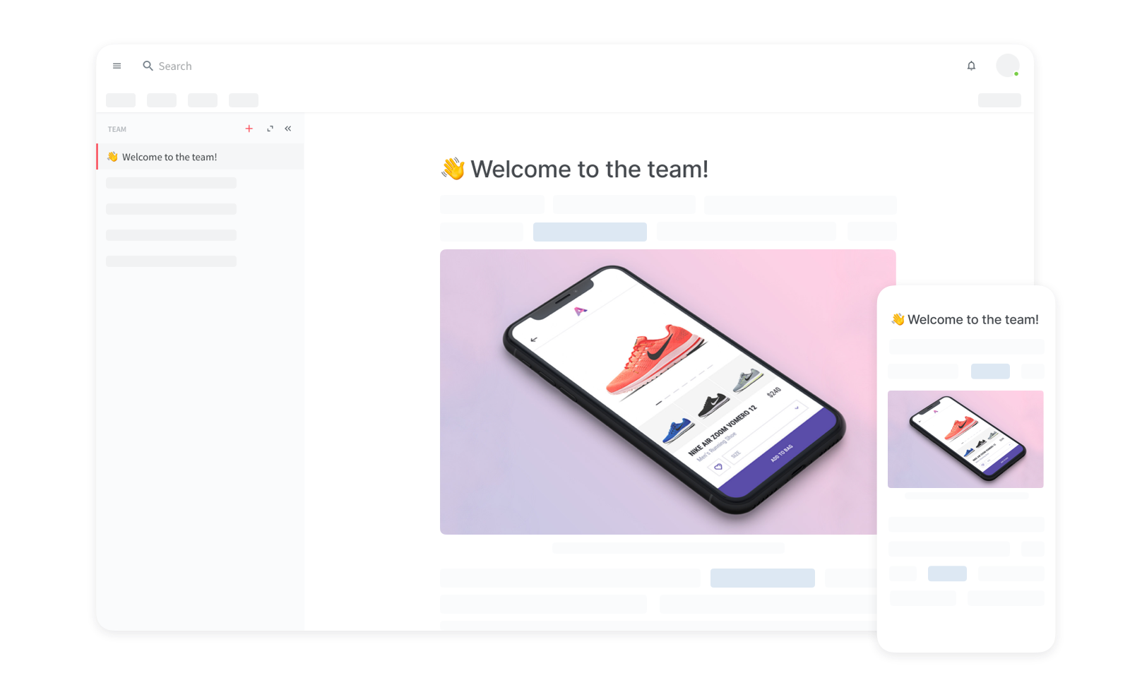
I don't understand how you can post this screenshot[2] and talk about information density. The information density of your current product is very low.
But the worst problem is the incredibly low contrast of your UI. Look at that screenshot again. Look at the links on the right side of the screen. They are barely readable on a full-size, matte monitor indoors. Now imagine someone using a glossy monitor facing a window during daytime. Imagine someone using a laptop with a glossy screen on a desk with fluorescent lights overhead. Imagine someone using a tablet outdoors. Might as well try to read a cloud floating overhead! The NN Group also has an article[3] about this, and your screenshot looks as bad as or worse than all of their examples of what-not-to-do.
Where are these professional "designers" learning to make these horrible mistakes? Why are they still employed in the field?
I am sorry to hear that you are upset with our current experience.
> So the most important link on your entire web site is effectively still invisible.
Where would you like the link to be and how should it look?
> I don't understand how you can post this screenshot[2] and talk about information density. The information density of your current product is very low.
What would you like to change exactly regarding the information density?
> But the worst problem is the incredibly low contrast of your UI.
Would a high contrast theme solve the problem for you?
In general, I am more than happy to offer you a Skype/Chat session, where we could discuss the design in more detail. Feel free to drop me a line at bjoern@nuclino.com
Can you be more specific on how your tool compares to specific product? I've used many and been disappointed. Yours (from the home page) seems similar to Quip, which is nice but seems a bit clunky and doesn't have enough integration with tools i already use.
We do a lot of this stuff on Google Drive, Github and Slack Posts. Google Drive is nice because it has permissions and company administration. Slack is nice because everyone uses it, it is easy, and it's naturally where these types of conversations happen already. But Slack posts are sort of buggy and unfinished, and Google Docs don't have persistent chat.
Github is nice for developers but doesn't extend beyond them, and has no real-time functionality.
Curious how you see yourself fitting in this world?
Slack is where our conversations live, but trying to keep more persistent and organized information there didn't work well for us.
We are also using Google Drive, but mainly for file management and working on documents which require full control over the styling and layout (e.g. legal documents that need to be printed). For more dynamic content and ad-hoc information, it feels too heavy to us.
Github (Wiki) is great for static text content and fine grained change tracking. Besides that, it's rather hard to use for non-developers as you pointed out.
We use Nuclino for collaborating on rich content that is more persistent than conversations in Slack and which does not need the overhead of a system like Google Drive. We haven't used Quip too much, but feel that it's rather similar to Google Drive with the files, folders, documents, spreadsheets and the likes.
To keep the core experience lightweight in the long term, we plan on supporting integrations that extend Nuclino.
Congratulations on the product. I will suggest this to my colleagues at work. We're currently using Google Docs to share/work on knowledge and we're not happy with it. Although Google Docs style comments would be nice to have in the future.
Unfortunately your "Try it now for free" button doesn't seem to resolve at the moment.
I saw that you are supported by UnternehmerTUM and would be interested to hear about your experience. I am studying at LMU and I am currently in the process of starting my own gig.
Especially the Techfounders program sparked my interest.
If you want to, you can also E-Mail me. My address can be found in my profile.
Great! Let us know how it goes with your colleagues :)
That's strange, the button should actually work. This is probably related to a bug in Safari. Would be great if you could try it in Chrome, as it is the only browser we currently test in.
Really love the idea, we have been struggling with this issue quite a bit in my office.
For me the one killer feature that I would want is comments. The commenting feature is the main reason our team uses Google docs, despite the major issues with it as an information hub.
Thanks for the input! We might add an open "Test Team" to the landing page. Until then you're free to use a spam address to convince yourself of the product ;)
Thanks for the feedback! It's always hard to get contrast right on all the different screens, but we'll look into it.
I can say that we've reached about 500 pages in our team and it's still working great. Nevertheless, we definitely plan on introducing more advanced organization and visualization features for teams with large amounts of documents.
The product is sweet. Enjoyed the UI/UX. However I think the landing page needs a little bit more love (pricing, team, contacts, use case, features lists) what about importing from existing Wikis or plain documentation text files (e.g. markdown, asciidoc)?
Glad you like it and thanks for your input regarding the landing page. There's definitely more work to do. What we're currently working on is some videos that will describe different use cases and how to use Nuclino. The other points you mentioned will follow soon.
Currently, we don't have any importing functionality, but we'll work on that in the near future. It might also be possible that we will provide an API that allows users to create custom import scripts for arbitrary file formats.
Good point, we have export on our roadmap. (Of course we use replication and perform daily backups to S3, but I understand your concerns nevertheless)
What kind of export would you like to see? Exporting the whole content of a team as HTML, generating PDFs for all the pages, generating Markdown files? Any preferences?
Probably something more semantically structured than HTML. Markdown could be an option. Maybe something that could be reimported for a 'rogue employee gone mad' scenario?
We plan on charging a monthly fee per user similar to the premium offerings of products like Slack, Trello, and Asana. We're also thinking about offering a free version with a limited feature set, but have not decided how this will look exactly.
There's currently a bug that forces you to hit Space after pasting a link, for it to be recognized as a link. We'll fix this soon, but for now you can just hit Space after the link.
After having tried countless knowledge management tools that were either too bloated and slow or focused on single users, we set out to create a lightweight wiki optimized for teams.
Some of the main features include:
* Everything is shared in real-time
* Instant fuzzy search
* Markdown commands
* Easy linking of pages using "@"
* Automatic tagging based on page titles
* Graph visualizations of tags and pages
You can think of it as an nvALT + real-time collaboration + rich content.
We've been dogfooding and testing this with a few startup teams over the past few months and would be happy to get your feedback and to answer any questions!